Cambridge: four hundred years of Bible craft
Cambridge printed its first Bible in 1591 — twenty years before the King James existed.
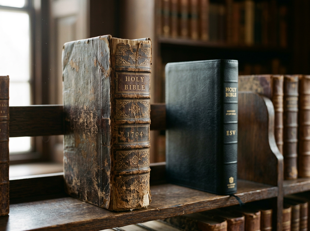
A weathered 1704 leather Bible standing on a library shelf beside a modern goatskin edition.
Cambridge University Press printed its first Bible — an edition of the Geneva Bible — in 1591. That is twenty years before the King James Version existed. Four centuries later, Cambridge is still printing Bibles, and the link between those two facts is not coincidence. It's a kind of institutional muscle memory.
King's Printer.
Cambridge holds the historic title of Queen's (or King's) Printer. As King's Printer, the Press is entrusted by the Crown with the preservation of the text of the Authorised Version of the Bible — the 1611 King James — and of the Book of Common Prayer. These are not just two old books. They are two of the foundational documents of the English language. Whatever else has happened in four centuries of British religious and political history, somebody has had to keep the words right. That somebody, in large part, has been Cambridge.
An unbroken tradition.
Cambridge has produced Bibles continuously since the late sixteenth century. The current range is printed by Royal Jongbloed in the Netherlands — one of the world's two or three finest Bible printers — using thin, high-opacity Indian paper and the precision techniques that have come to define Cambridge quality.
- ◆Line-on-line printing across the range, with presses run at slower speeds for tighter registration.
- ◆High-opacity India paper — typically 28gsm for premium editions, with carefully calibrated titanium dioxide content.
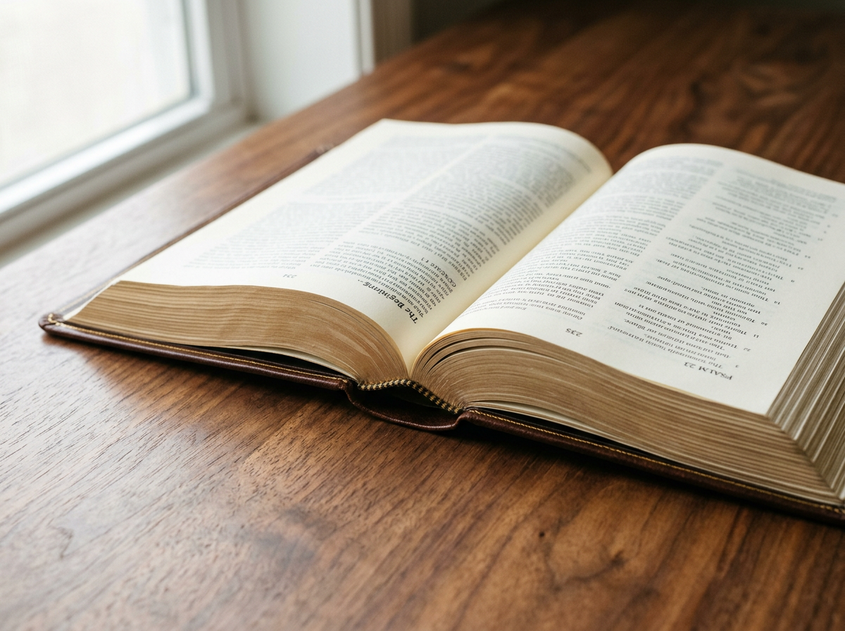
- ◆Smyth-sewn binding throughout the range, even on the most affordable editions. Cambridge does not glue Bibles.
- ◆Edge-lined goatskin for premium editions, giving extreme flexibility and the famous 'falls open' feel.
- ◆The Clarion setting — Cambridge's acclaimed single-column layout with generous leading, widely regarded as one of the most readable Bible page designs ever produced.
Designed for a purpose.
Different Cambridge editions are designed for different uses, and once you know what to look for, the differences become legible.
- ◆Pitt Minion — small-format, intended to be carried. The smallest readable Cambridge layout.
- ◆Clarion — single-column, generous leading. The reader's edition. Designed to disappear and let you read the prose.
- ◆Concord Wide Margin — the preacher's and student's Bible. Wide outer margins for notes; pages chosen for ink-bleed resistance.
- ◆Diadem — premium goatskin presentation editions. The aspirational shelf piece.
“Since printing our first Bible in 1591 we have maintained an unrivalled reputation for expert craftsmanship and respect and care for the text.”
Why this matters.
It would be easy to read all this as institutional self-regard. But there is something quietly remarkable about an organisation that has been doing the same thing — printing Bibles, carefully — for longer than most countries have existed. Every Cambridge Bible carries that history forward, in the choice of paper, the choice of typeface, the way the spine is sewn, the way the gold is laid down. The book in your hand is the latest expression of a four-hundred-year-old practice.
There are other excellent Bible publishers — Allan, Crossway, Schuyler, Holman, Zondervan, SPCK. Cambridge isn't the only good answer. But it is, in a particular sense, the original one.
Every Bible we sell lists its paper weight, binding type and leather — so you can choose with the same care you've just been reading about.
See the collection