The Craft · No. 02·Materials
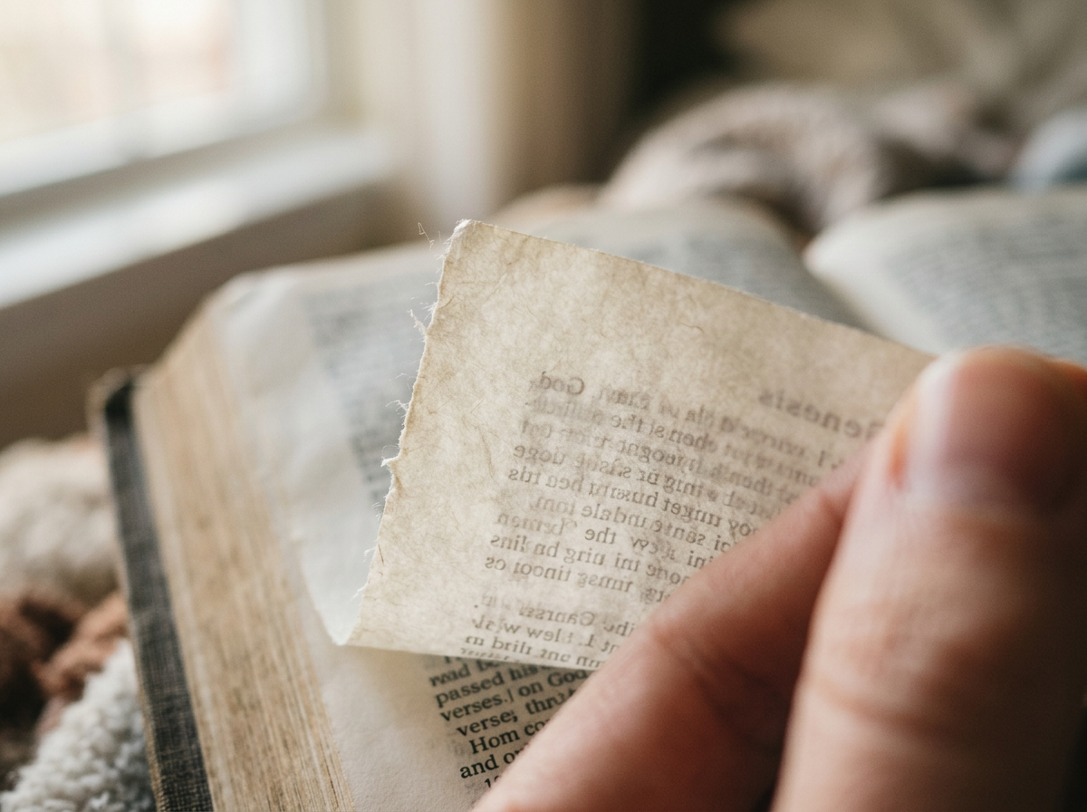
Thinner than a human hair: the extraordinary engineering of Bible paper
Three quarters of a million words in a single portable volume. The secret is the paper.
A slow, considered journal about the paper, ink, leather and thread that shape a well-made Bible. Each edition explores one detail of the craft — what to look for, what specialists notice, and why it matters in a book you might keep open for fifty years.
11 editions published · 7 forthcoming
Five things you can check in thirty seconds. No expertise required.
Read the essayThree quarters of a million words in a single portable volume. The secret is the paper.
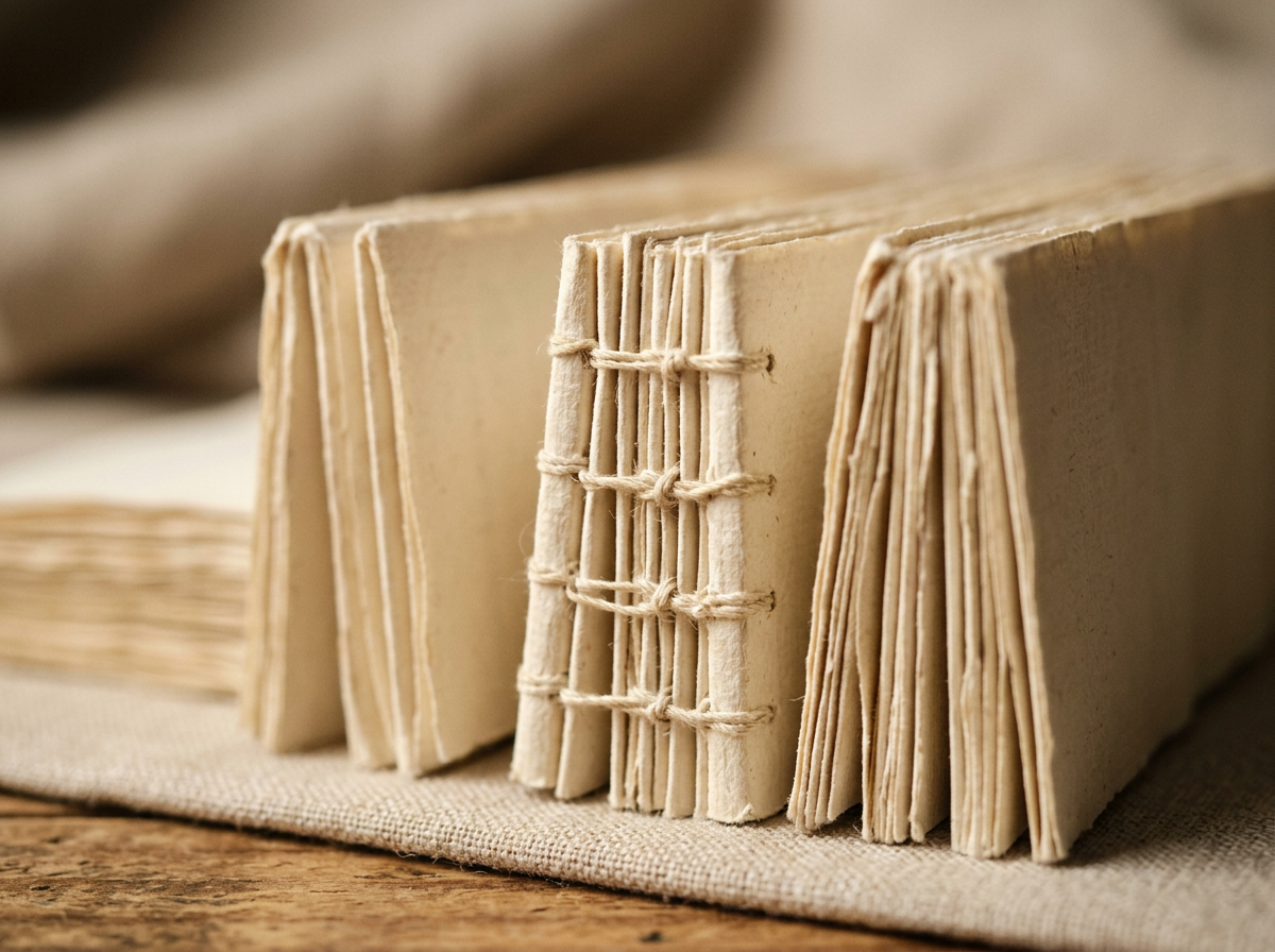
A glued spine cannot survive twenty years of daily use. Here's what does — and why.
The Bible is the reason modern typography exists — and every typeface decision since has been shaped by it.

That stripe of gold isn't just decorative. It seals, protects, and reveals.
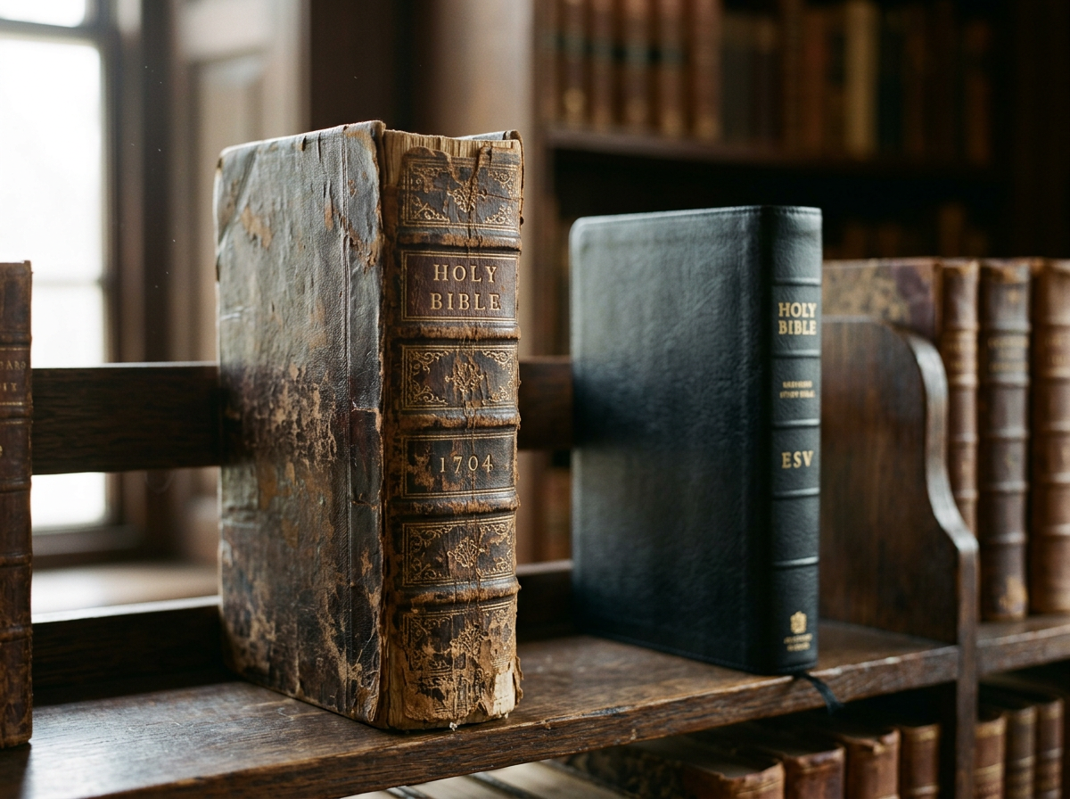
Cambridge printed its first Bible in 1591 — twenty years before the King James existed.

How a single Kickstarter changed what people expect a Bible to look and feel like.
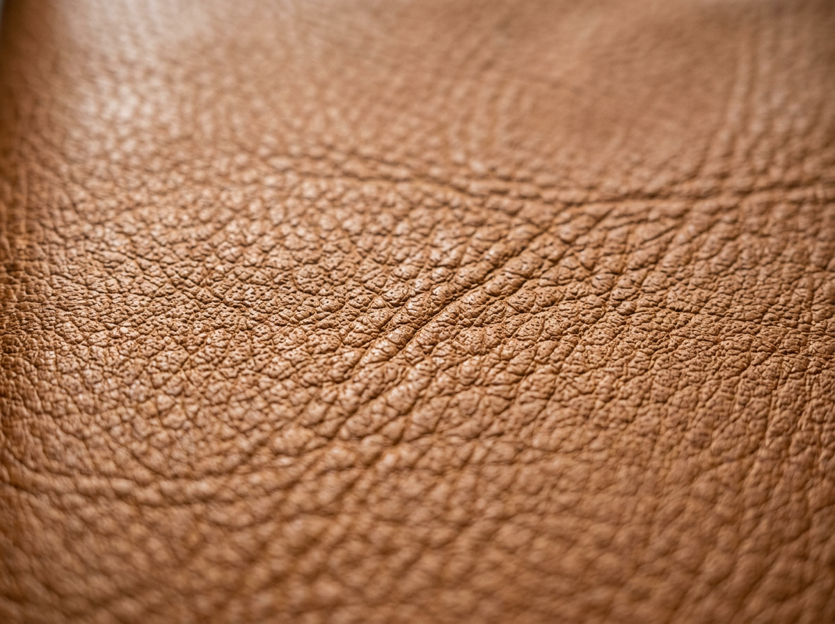
The goat's life is written into the cover. Scratches, scars and all.
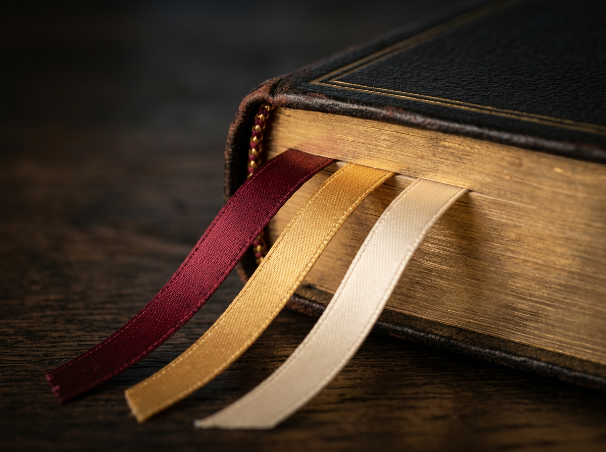
A love letter to the finishing touches that turn a book into an heirloom.

Christenings, weddings, milestone birthdays — choosing well matters.
Why some Bible covers wrap softly around the page block — and what that quiet detail says about how the book is meant to be carried, opened and held.
When type on the front of the page lines up exactly with type on the back, a Bible reads quietly. When it doesn't, your eye knows — even if you don't.
A two-millimetre band of woven thread at the top of the spine. Mostly decorative now — but it tells you almost everything about how the book was built.
Printing the words of Christ in red doubles the work. Good red-letter editions sing; bad ones fade to pink. The difference is in the press, not the prayer.
Four words that get used almost interchangeably in Bible listings — and refer to four very different things. A plain-English guide to telling them apart.
The narrow column down the centre of the page is a five-hundred-year-old invention. Here's what it does — and why some editions handle it gracefully and others don't.
Those small half-moon cuts down the fore-edge are not decoration. They're a hundred-year-old usability feature — and a good test of finishing quality.
Patina, soft corners, a spine that remembers your hand. The marks a fine Bible gathers over twenty years — and the ones it shouldn't.