The Bible as beautiful object: a design revolution
How a single Kickstarter changed what people expect a Bible to look and feel like.
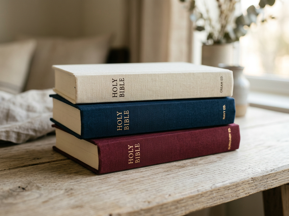
Three minimalist linen-bound Bibles stacked on a pale oak surface: cream, navy and burgundy.
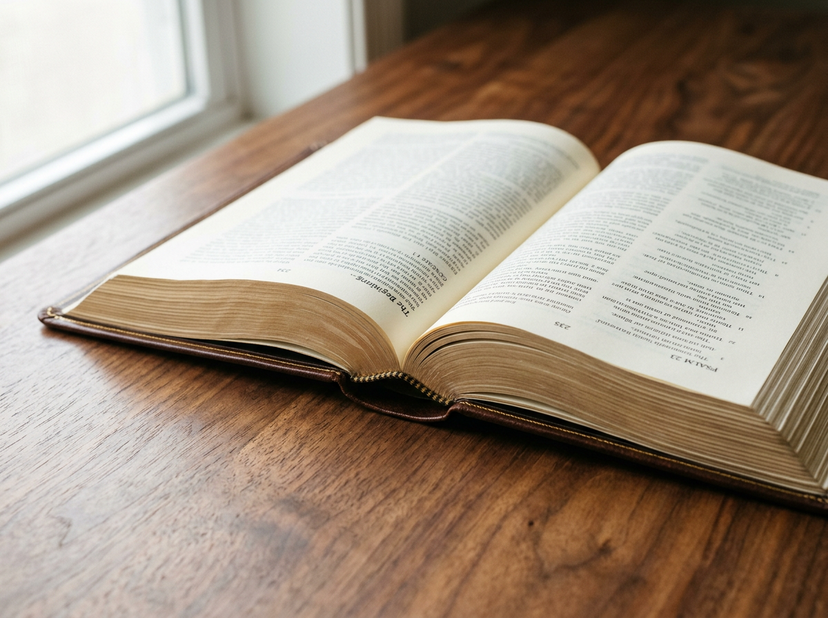
For most of the last hundred years, Bibles looked a certain way. Black or burgundy leather, gilt edges, two columns of small type, occasionally a red-letter edition. Function over form. Reverence by uniformity. The way it had always been done.
And then, fairly recently, that changed.
The Bibliotheca moment.
In 2014, an independent designer called Adam Lewis Greene launched a Kickstarter campaign for a project he called Bibliotheca. The proposition was simple: a Bible designed not as a reference manual but as literature. Five volumes. Custom typefaces. No verse numbers. No chapter divisions. No columns. Generous margins. Beautiful linen-bound covers. Read from start to finish, like Tolstoy or Dickens, instead of dipped into for verses.
Greene asked for $37,000. He raised $1,440,000 from nearly fifteen thousand backers. At the time it was the highest-grossing book project in Kickstarter history.
“Bibliotheca proved something publishers had under-estimated: a large audience wants a Bible that looks like a beautifully made book, not a reference manual.”
The market responds.
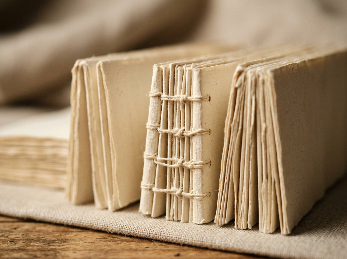
What followed has been, by Bible publishing standards, a small revolution. Crossway launched the ESV Reader's Bible, then the six-volume Reader's Bible. Holman, Thomas Nelson, Zondervan and SPCK invested in design-led premium lines. Whole new categories arrived: journalling Bibles with wide margins and heavy paper for handwritten notes; reader's editions with no verse numbers and long flowing single columns; small artisan binderies offering bespoke goatskin rebinds with custom art gilt.
In 2023 The Good Publishing Company put up a billboard above Canal Street in Manhattan advertising a £300 art-inspired NIV Bible: gold foil on a crimson soft-touch cover, sustainably sourced paper, designed to be displayed as well as read. Five years earlier, a billboard for a designer Bible would have been unthinkable.
Who's actually buying these?
The audience for design-led Bibles is broader than the traditional Bible-buying public. It includes people who already own three Bibles and want a beautiful one. It includes people drawn to fine objects in general — the same people who care about the paper in a notebook, the binding of a Penguin Classic, the build of a Leica. And it includes a surprisingly large number of people who don't necessarily think of themselves as religious, but who are curious enough to want a copy that respects the text as literature.
What it changed.
The design revolution didn't replace the traditional Bible. It expanded what the category looks like. Today, a serious Bible shop has to stock both — the ESV Diadem in goatskin and the cloth-bound Reader's Bible; the Cambridge Clarion and the SPCK design edition. It also has to talk about them in a different language, because the people buying them care about different things: the paper, the type, the materials, the look.
A Bible can be a thing of beauty. Not as an afterthought, but as a reflection of the value people place on what's inside it. That's the part nobody can un-learn now.
Every Bible we sell lists its paper weight, binding type and leather — so you can choose with the same care you've just been reading about.
See the collection