From Gutenberg to Garamond: how typography shaped the way we read
The Bible is the reason modern typography exists — and every typeface decision since has been shaped by it.
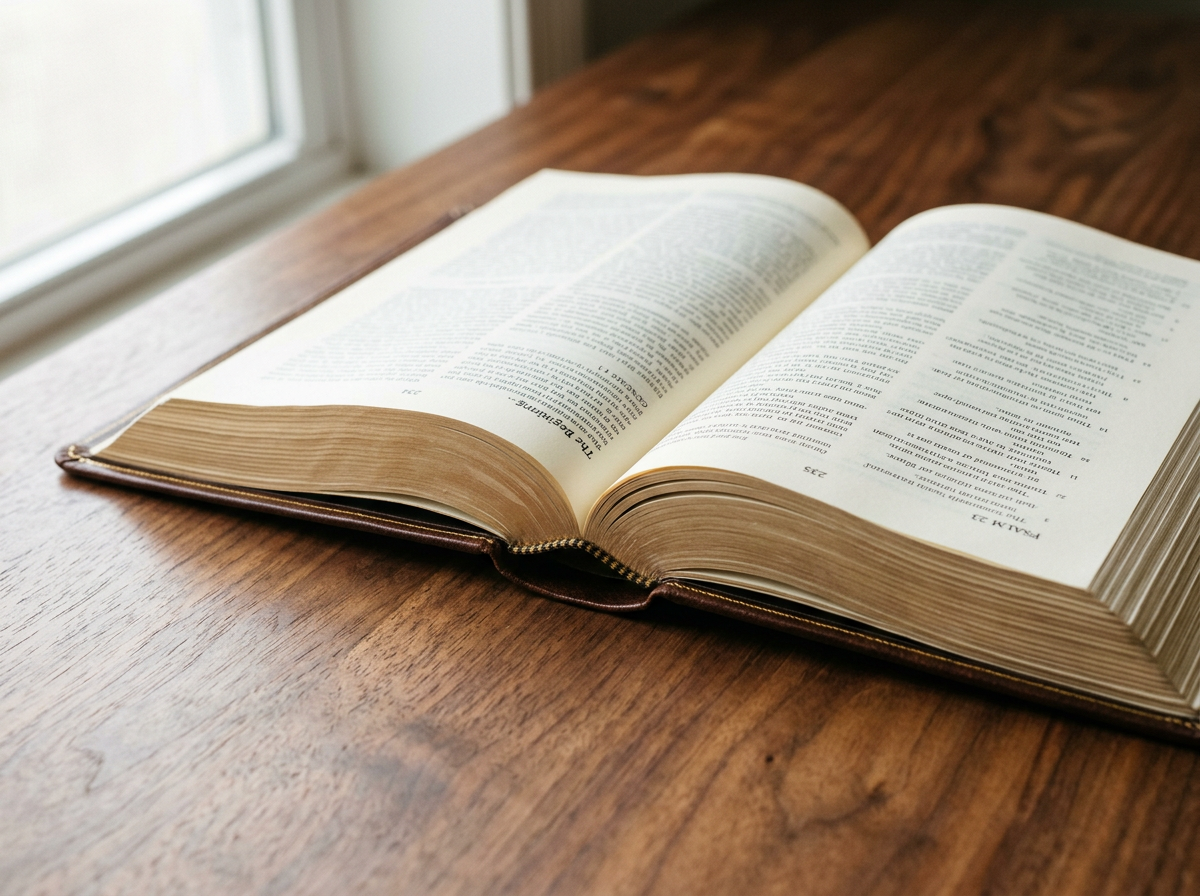
Close-up of crisp serif type printed on warm cream Bible paper, page curving softly out of focus.
Pick up almost any book printed in the last hundred years and you are looking, in part, at decisions made for the Bible. Modern typography — the way we set type, the typefaces we choose, the proportions of a page — was shaped, more than by any other text, by the demand to make Scripture both legible and portable.
It started in Mainz, around 1455, with a German metalworker called Gutenberg.
Gutenberg, and the first great typeface.
The Gutenberg Bible was set in a blackletter typeface known as Textura, designed to mimic the dense, vertical handwriting of the liturgical scribes who had until then copied Bibles by hand. It was beautiful but austere — optimised for the trained eye of a medieval cleric, not for the general reader.
Gutenberg's invention wasn't really the printing press. Wine presses had existed for centuries. His invention was movable type — and the typographic system that made it possible. Each letter was an individual cast metal piece, designed to fit precisely against its neighbours, to print evenly, and to be reused. It was the first system in which type design and book design were inseparable.
From blackletter to Roman.
As printing spread across Europe, Roman typefaces — based on humanist handwriting and the inscriptions of classical Rome — began to replace blackletter. They were cleaner, more legible, and better suited to the humanist ideals of the Renaissance. But Bible publishing moved more slowly than other book trades. The 1611 King James Bible was printed in blackletter; the transition to Roman type for English Bibles happened gradually over the seventeenth and eighteenth centuries.
“Bible typography is the hardest job in publishing: set three quarters of a million words in a portable volume, at a size that's actually readable, on paper thin enough to keep the book in your hand.”
The compounding problem.
The core problem of Bible typography has always been the same: how do you set 750,000 words in a compact volume, at a size that is comfortably readable, on paper thin enough to keep the book portable, without the text on one side bleeding through to ruin the other? Every variable interacts with every other one. Type design, point size, leading (the space between lines), column width, paper weight, paper opacity, ink density, binding flexibility — change any one and the whole system shifts.
The great Bible typefaces.
- ◆Garamond — designed in sixteenth-century France and still one of the most enduring typefaces in Bible publishing. Prized for its elegance and its economy: it fits more words per line than most alternatives without feeling cramped.
- ◆Times New Roman — designed in 1931 by Stanley Morison for The Times of London. Compact, sturdy, and unusually legible at small sizes, it became a workhorse of mid-twentieth-century Bible publishing.
- ◆Lexicon — a Dutch typeface by Bram de Does, engineered specifically for the demands of Bible typesetting. It comes in two stem-length variants — short and normal — letting typographers fine-tune the texture of the page for different paper weights. A complete licensed set costs over £3,000.
- ◆Lucerna — a contemporary face designed for Bible readability, focused on fitting more text per line while preserving comfortable reading rhythm.
- ◆Comfort Print — Zondervan's proprietary face, designed to maximise legibility at very small sizes with generous character spacing.
The quiet importance of leading.
Leading — the space between lines of text — matters in any book, but it matters more in a Bible than almost anywhere else. Because the paper is thin and the text is small, generous leading reduces the visual noise of show-through from the reverse side. Tight leading on Bible paper produces a page that feels grey and crowded; generous leading produces a page that feels open and unforced.
One column or two?
Bible publishers have long argued about single- versus double-column layouts. Double-column is the traditional choice — more space-efficient, easier to scan reference numbers, easier to absorb in short passages. Single-column reads more naturally as continuous prose, and is increasingly popular with new readers and reader's editions.
The choice changes the entire feel of the book. A double-column layout signals reference and study; a single-column layout signals literature and immersion.
Bibliotheca and the typographic Bible.
In 2014, a designer named Adam Lewis Greene launched a Kickstarter to produce a Bible designed purely as literature: five volumes, custom typefaces, no verse numbers, no chapter divisions, no columns. The campaign raised over $1.4 million from nearly fifteen thousand backers — at the time the highest-grossing book project in Kickstarter history. Bibliotheca proved something publishers had under-estimated: there is a large audience of people who want a Bible that looks and feels like a beautifully made book, not a reference manual.
“The best Bible typography is the kind you never notice — because you're too absorbed in the words.”
That, ultimately, is the test. Pick up a Bible. Read a chapter. If you stop noticing the typography, the typographer has done their job. If something keeps tugging at your attention — type too small, leading too tight, columns too narrow, show-through too loud — the book has, in some quiet way, failed.
Every Bible we sell lists its paper weight, binding type and leather — so you can choose with the same care you've just been reading about.
See the collection